

A combo chart looks flat until the small series is on the right axis
Updated
A combo chart can draw one series as columns and another as a line. Both series start on the same axis. If one series is revenue in the thousands and the other is a rate such as 0.02, the rate is a line drawn on top of the axis. It looks flat, or missing. The line is there. Its scale is the revenue scale. The right axis is a per-series setting. It is off until you turn it on for that series. Nothing in the data is an error value.
Gaps from #N/A or #DIV/0! are chart error gaps. A SPARKLINE is SPARKLINE charttype. Keep the Google Sheets UI in English. Sheet Error is an independent formula-error library, not a Google product.
Recreate it on a blank sheet
Section titled “Recreate it on a blank sheet”- Open a blank spreadsheet. In A1 type
month, B1revenue, C1rate. A2Jan, B21000, C20.02. A3Feb, B31400, C30.03. A4Mar, B4900, C40.025. Format C2:C4 as percent if you want2%on the sheet. The underlying values stay near zero. The format is not a second axis.
One axis. Select A1:C4. Insert → Chart. In the Chart editor, set the chart type to Combo chart. Set revenue to columns and rate to a line if the editor did not. Leave both series on the left axis. The columns show 1000, 1400, and 900. The rate line sits on the bottom of the plot, almost flat, because 0.03 against a maximum near 1400 is a hair above zero. The line is not a broken series. Leave the chart like this.
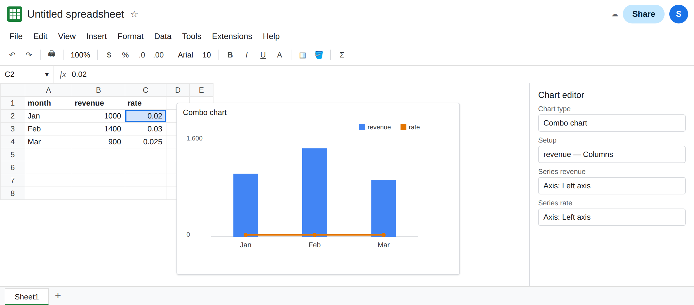
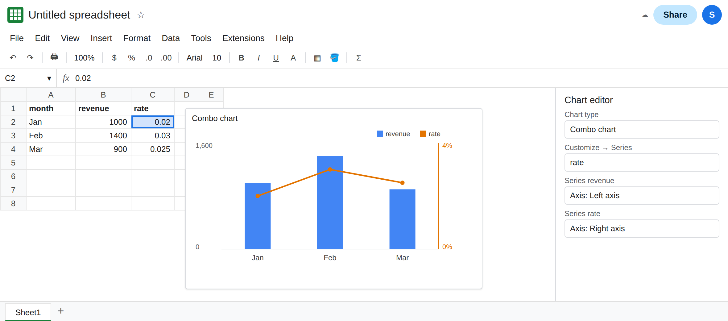
The right axis is off until you name the series. Double-click the chart. Chart editor → Customize → Series. Choose the rate series in the series list. Find Axis and set it to Right axis. The line lifts off the floor and shows a slope from 0.02 to 0.03 to 0.025. The columns stay on the left. A second vertical scale appears. That chart is the control. Switch rate back to the left axis and the line drops again. Put it on the right axis and leave it there for the fix, after you have seen the flat line.
A zero axis is not this. If C2 is #DIV/0! or blank, the line gaps or drops for that point. That is chart error gaps. These three rates are real numbers. Do not replace them with NA() to “fix” a scale.
Percent labels are not an axis. Formatting C as percent changes the axis tick labels only after the series has a scale where 2% is visible. On the shared left axis the tick labels are still the revenue scale. See pie percent labels for slice labels, which are a different control.
What is actually wrong
Section titled “What is actually wrong”- Combo means two chart types, not two axes. Columns plus a line still share the left axis until a series is assigned to the right. The flat line is
0.02plotted on a 0-to-1400 scale. - The assignment is per series. Putting
revenueon the right axis and leavingrateon the left inverts the problem: the columns become the flat series. Read the series name in the Customize list before you change Axis. - The spreadsheet locale and the number format do not create an axis. A column stored as
2%is the number0.02unless you typed2and only painted a percent sign with text. See dates stored as text for the same class of “looks right, is not the value” on dates. Check the formula bar on C2. It should show0.02, not the characters2%. - Smooth or trendline options do not rescale a series. A trendline of a line that is stuck at zero is another line stuck at zero.
- Excel’s combo chart has a similar secondary-axis checkbox. The Sheets control is Customize → Series → Axis. Do not look for Excel’s Format Data Series pane.
This is not SPARKLINE. A sparkline has no right axis. "ymax" on a sparkline is SPARKLINE charttype.
You can duplicate the chart before the fix if you want the flat one and the scaled one side by side. Otherwise set the rate series back to the left axis, confirm the line sits on the floor, then apply the fix.
Put the small series on the right axis. Chart editor → Customize → Series → rate → Axis → Right axis. The line shows the rate shape. The columns keep the revenue shape.
When both series are large, you do not need a second axis. Two revenue lines in the same hundreds belong on one axis so the slopes compare. A right axis is for a series whose units are not the left series’s units.
Do not multiply C2 by 100 to “make the line visible” and also format it as percent. You will plot 2 as if it were a revenue and the right axis will show a meaningless scale. Keep 0.02 and move the series.
If the line is flat and both series say Left axis, the scale is shared. If the line has gaps, the cells are errors, and you are on the gap page.