

FREQUENCY adds an overflow bin, so the chart has one bar too many
Updated
FREQUENCY(data, bins) returns one count per cutoff, plus one more count for every value greater than the last cutoff. Two bins produce three numbers. The third number is not a total and not a broken extra. It is the overflow bin. A chart that uses the three counts and only two category labels still draws three bars. The last bar is unlabeled, or it inherits a wrong label, and the histogram looks one category too long. Dropping that bar to “fix the chart” throws away the values that were above the last cutoff. They no longer appear in any bar, and the bar heights no longer add up to the number of data points.
A spill blocked because you did not leave room for that extra row is FREQUENCY bins. Bins written across a row instead of down a column are FREQUENCY horizontal. Keep the Google Sheets UI in English. Sheet Error is an independent formula-error library, not a Google product.
Recreate it on a blank sheet
Section titled “Recreate it on a blank sheet”- Open a blank spreadsheet. In A1 type
score. A22. A33. A45. A59. A611. Five scores. In B1 typecutoff. B24. B310. Two cutoffs, ascending. You want “≤ 4”, “≤ 10 and greater than 4”, and you may not have planned a home for11.
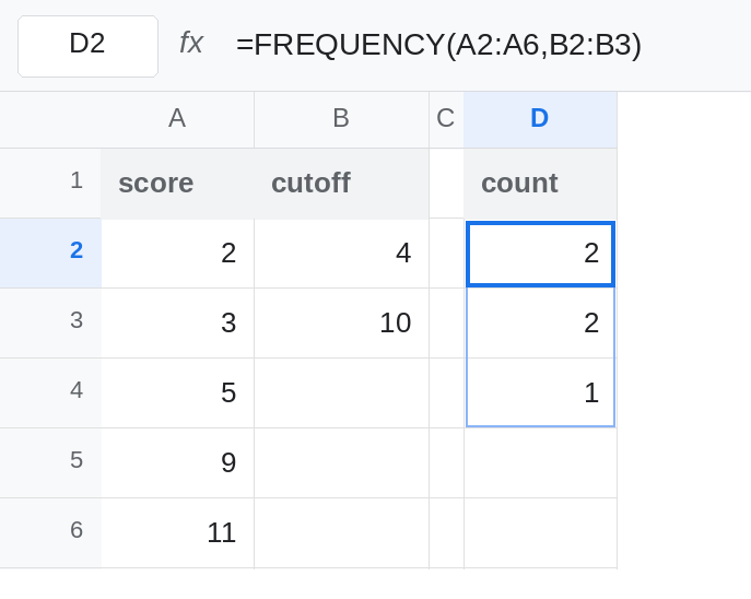
Three counts. In D1 type count. Leave D2:D4 empty. In D2 enter =FREQUENCY(A2:A6,B2:B3). D2 is 2 (2 and 3, the scores ≤ 4). D3 is 2 (5 and 9, scores > 4 and ≤ 10). D4 is 1 (the 11, which is > 10). =SUM(D2:D4) is 5. Every score landed somewhere. D5 is empty. The spill stopped. Leave D2:D4 as 2, 2, 1.
Two labels, three bars. In C2 type low. In C3 type mid. Leave C4 empty. Select C2:D4. Insert → Chart. Set the chart type to Column chart. In the chart editor, turn off Use column A as headers / Use row 1 as headers if the first count was promoted to a series name. The chart has three bars because D2:D4 has three numbers. The third bar’s height is 1, and its label cell C4 is blank. That bar is the overflow. It is the score 11. Leave the chart up.
Deleting the overflow hides a score. In H2 enter =CHOOSEROWS(D2:D4,1,2). H2 is 2 and H3 is 2. =SUM(H2:H3) is 4, not 5. The 11 is in no bar. A chart of H2:H3 with labels low and mid looks tidy and is missing a score. Leave H2 as that shortened pair so the missing 1 is obvious. CHOOSEROWS itself is CHOOSEROWS negative index when the index is the problem. Here the index is legal and the data loss is the problem.
The overflow is not the total. D4 is 1, not 5. =SUM(D2:D4) is the total. Adding the word total in F4 and charting it as a third category names the overflow wrong. The bar would still be 1.
Leave D4 as 1. Leave the two-label chart, or H2, as the misleading picture.
What is actually wrong
Section titled “What is actually wrong”- Output rows = number of cutoffs + 1. The extra row is “greater than the last cutoff.” D4. It is not optional padding and not an error code.
#N/Ais not whatFREQUENCYuses for “nothing above.” A zero overflow is0, which is a real count. - The chart has one category per row of the spill. Two labels do not make
FREQUENCYreturn two rows. The third bar is D4. - Removing the last row removes data. The counts must sum to the number of numeric scores.
2+2+1is5.2+2is4. The missing1is the11. - Blank scores are ignored, not sent to the overflow. Text is ignored. A score stored as text will not appear in D4 or in any other bin, and the sum of counts drops with no triangle.
11typed as text is that bug. See CSV text vs number if the column came in from a file. - Unsorted cutoffs mis-file the counts and still return n+1 rows. The extra row is not the sorting bug. See FREQUENCY bins.
This is not a blocked spill. If D4 had contained the word note before you entered the formula, D2 would be #REF!. That overwrite is the other page. Here D4 is the overflow count itself.
Leave H2 as the two-row cut if you want the data loss visible. Chart the three-row spill with three labels.
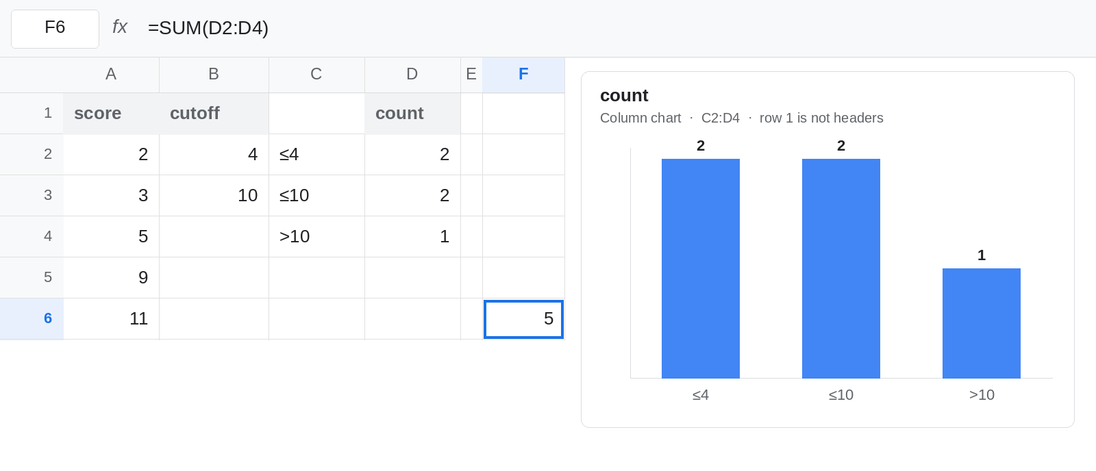
Name the overflow. Replace the short labels: C2 ≤4, C3 ≤10, C4 >10. Select C2:D4 and insert a column chart, with Use row 1 as headers off. Three bars, heights 2, 2, 1, labels that say what the cutoffs are. =SUM(D2:D4) in F6 is 5, the check that every numeric score was filed.
Raise the last cutoff when “above” should be empty. If no score should sit in the overflow, the last cutoff has to be at least as large as the largest score. Set B3 to 11. D2 stays 2 (≤ 4). D3 becomes 3 (5, 9, and 11). D4 becomes 0. The third row is still there. A bar of height 0 is an empty overflow, which you may drop only after you have seen the 0. Dropping it while it is 1 is how 11 disappears.
Do not SUM the bins to manufacture a total row inside the spill. FREQUENCY will not append a total. Sum the spill beside it.
If the chart has one more bar than you have cutoffs, that bar is the overflow. Label it or raise the last cutoff until its count is 0. If the bar heights sum to less than the number of scores, something was dropped: the overflow row, or a score that is text.