

Pie chart labels show the raw values, or 0, until the slice label is Percentage
Updated
A pie chart’s data labels are a chart setting, not a number format on the source column. Slice label chooses what is written on the slice: nothing, the value, the percent of the pie, or the label text. Left on Value, the slices show 30, 10, and 10 even when you wanted 60%. Set to Percentage, they show the share of the whole pie. Decimal places 0 on a value that is 0.2 displays 0. That is the 0% people report. The pie can still be the right shape. The label is rounded to nothing.
A combo chart’s axis scale is combo chart axis. Error cells in a line chart are chart error gaps. Keep the Google Sheets UI in English. Sheet Error is an independent formula-error library, not a Google product.
Recreate it on a blank sheet
Section titled “Recreate it on a blank sheet”- Open a blank spreadsheet. In A1 type
region, B1qty. A2East, B230. A3West, B310. A4North, B410. The total is50. East is60%of that total. West and North are20%each. Do not type those percents yet.
Labels show the quantities. Select A1:B4. Insert → Chart. Set the chart type to Pie chart. Double-click the chart. Chart editor → Customize → Pie chart. Set Slice label to Value if it is not already. The slices read 30, 10, and 10, or the region name plus those numbers, depending on the label choice. They do not read 60%. The pie drawing itself is already sized by share. The label is a raw value because you asked for the value. Leave this chart as the value-labeled pie.
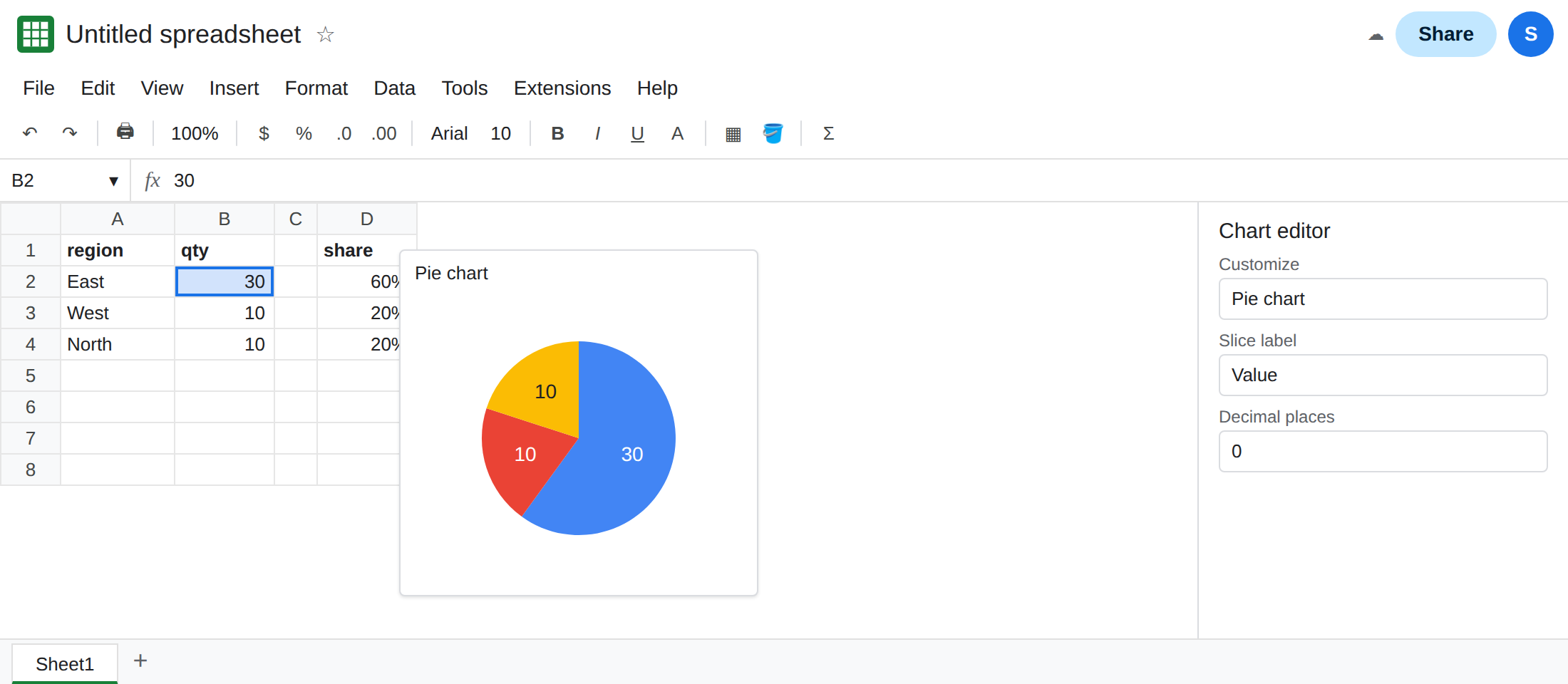
Percentage is a label mode. Duplicate the chart or change the same one after you have seen the values. Set Slice label to Percentage. The slices read 60%, 20%, and 20%. You did not add a percent column. The chart divided each qty by 50. Set Decimal places to 0 and the labels stay 60%, 20%, 20% because those shares are not fractions of a percent. Put decimal places back to 0 or 2 and leave the label on Percentage for the fix.
The 0 label. In D1 type share. In D2 enter =B2/SUM($B$2:$B$4) and fill D2:D4. D2 is 0.6. Format D2:D4 as percent. The cells display 60%, 20%, 20%. Select A1:A4 and D1:D4 and insert a second pie. Set Slice label to Value and Decimal places to 0. The labels collapse toward 1 and 0 because 0.2 rounded to zero decimal places is 0. The cells look like percents. The label is printing the underlying 0.2 with no decimals. That is the 0% scene. Leave this second pie mislabeled.
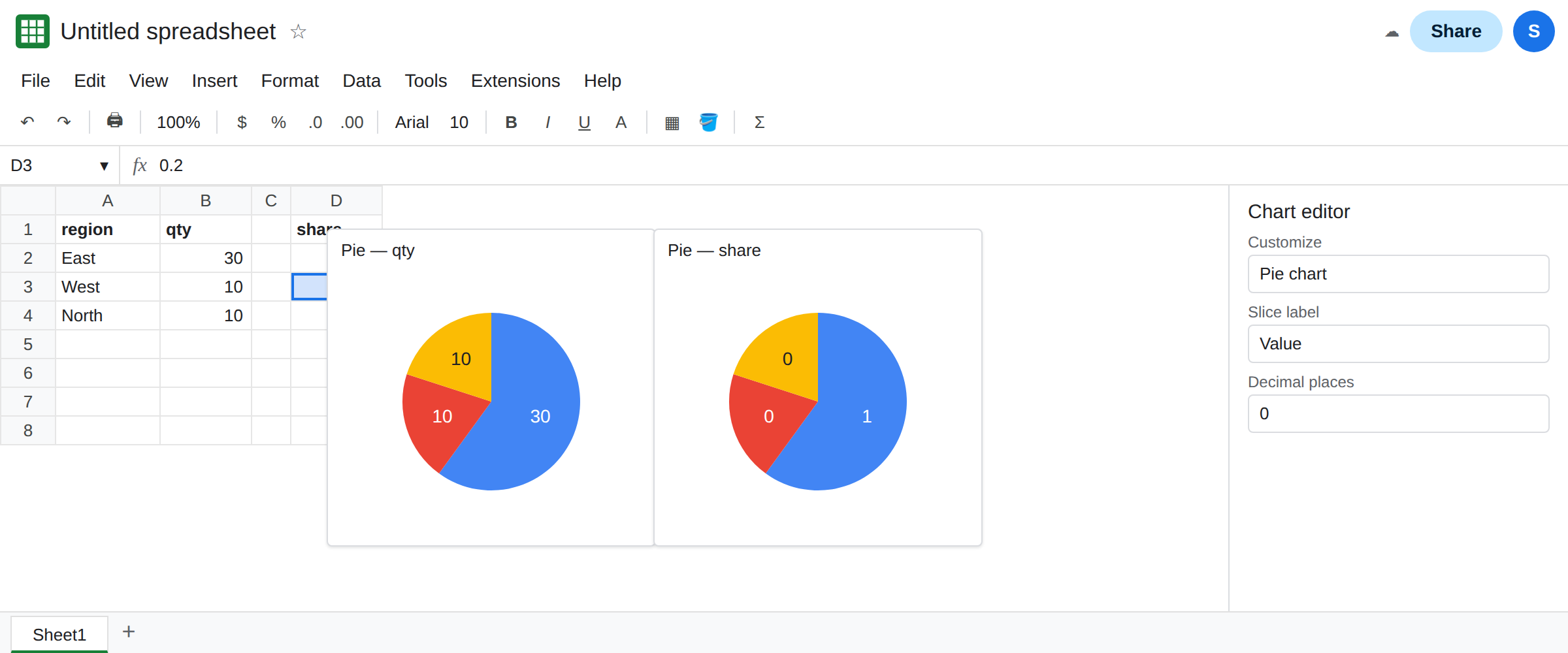
Percentage on the share column is still the pie’s share. On the second pie, set Slice label to Percentage. You get 60%, 20%, 20% again, because each slice’s share of the pie is unchanged. You do not get “percent of a percent” from that menu. The double count happens when a formula multiplies by 100 and the label mode is also Percentage. Do not add that formula here. See the fix.
What is actually wrong
Section titled “What is actually wrong”- The pie’s geometry uses the numbers as weights. The slice label is a caption. Value captions follow the cells, including a decimal-place limit that can print
0for0.2. Percentage captions follow the weight divided by the total of the weights. - A column formatted as percent is still a number.
60%in the grid is0.6in the formula bar. Value labels read0.6. With zero decimal places they read1or0. The format on D2 does not switch the chart to Percentage mode. - Decimal places in the pie panel apply to the label you selected. They are not the sheet’s number format, and they are not a second percent calculation.
- One slice of
0is a real empty category. Its percentage label is0%because its weight is zero. That is different from a0.2value rounded to0. Read the formula bar before you change the chart. - A bar or column chart does not have Pie chart → Slice label. Data labels on those charts are under Customize → Series. This page is the pie. A flat line on a combo chart is combo chart axis.
Leave the second pie on Value with decimal places 0 so the 0 label stays as the broken example. Use the first pie for the share labels.
Set Slice label to Percentage on the quantity pie. Chart editor → Customize → Pie chart → Slice label → Percentage. East reads 60%. West and North read 20%. Raise decimal places only when you need a fraction of a percent.
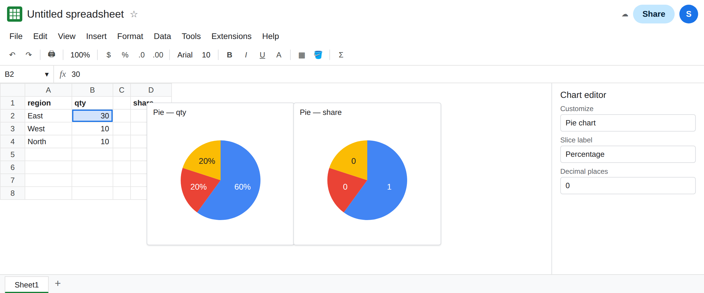
Chart the quantities, or chart the shares, not both at once. If the source is already 0.6, Percentage labels are still correct shares. Value labels need enough decimal places to show 0.6, or a percent format will not save a zero-decimal value label. Do not also set the label to Percentage and multiply the cells by 100. The slice would be labeled as if 60 were the weight.
If the slices show 30 and you wanted a share, the label mode is Value. If a slice shows 0 and the formula bar shows 0.2, decimal places ate the fraction. If the formula bar shows 0, the slice is empty and the chart is reporting that.