

FREQUENCY with bins in a row still spills downward, so a chart across that row mis-buckets
Updated
FREQUENCY(data, classes) counts how many values fall into each class. The documented data range is a column. The counts are always a column, one row longer than the number of classes. The last row is “greater than every class.” Bins typed in a row do not turn that spill sideways. Put the formula under the first bin and the counts run down the first column. The cells under the other bins stay empty. A chart of the bin row against those empty cells plots the wrong buckets, or plots nothing, while the real counts sit unread in the column.
The extra row, and a class list typed out of order, are FREQUENCY bins. This page is the horizontal class range and the chart that reads across it. Keep the Google Sheets UI in English. Sheet Error is an independent formula-error library, not a Google product.
Recreate it on a blank sheet
Section titled “Recreate it on a blank sheet”- Open a blank spreadsheet. In A1 type
v. A21. A33. A45. A57. A612. Five values, in a column. In B1 typebin. B24. B38. Two limits, top to bottom.
Vertical classes, the control. In D1 type down. In D2 enter =FREQUENCY(A2:A6,B2:B3). D2 is 2 (the 1 and the 3, values ≤ 4). D3 is 2 (the 5 and the 7, values > 4 and ≤ 8). D4 is 1 (the 12, greater than 8). Three cells. 2+2+1 is 5. That column is the histogram you can defend. Leave D2:D4 as 2, 2, 1.
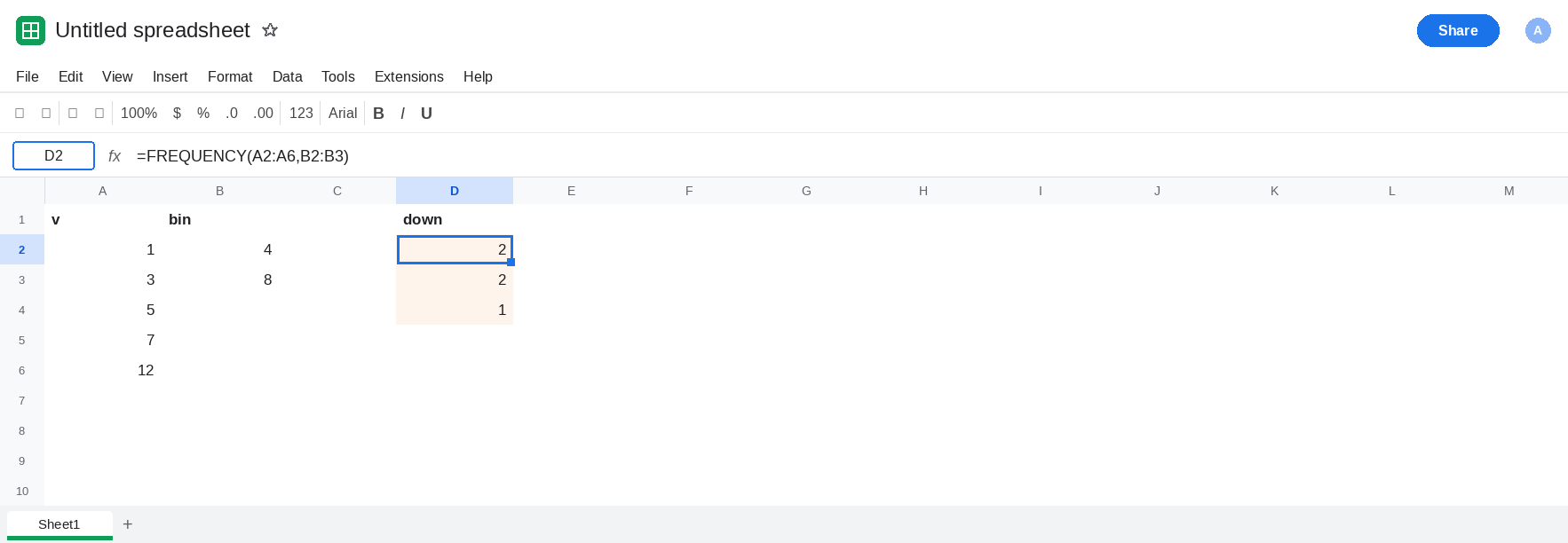
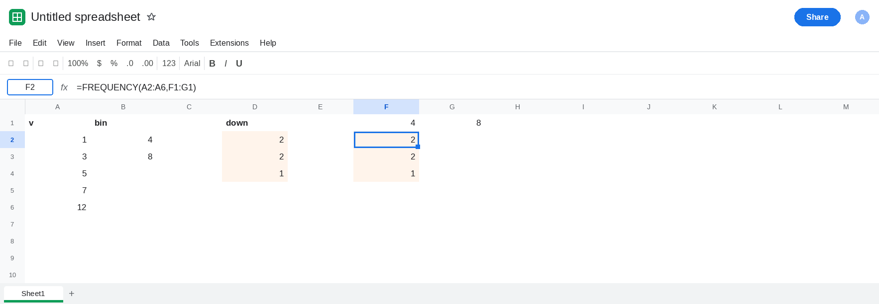
The same limits in a row. In F1 type 4. G1 type 8. Leave F2:G4 empty. In F2 enter =FREQUENCY(A2:A6,F1:G1). The counts spill down F2:F4. Read them against D2:D4. They are 2, 2, 1 when the limits are 4 then 8. G2 and G3 are empty. There is no count sitting under the 8. A chart whose series is F2:G2 is looking at 2 and a blank, not at 2 and 2. The overflow 1 is in F4, with no bin above it in row 1. Leave F2 as that column. Leave G2 empty.
Labels you might chart by mistake. In F6 type <=4. G6 type <=8. Those two labels are a reasonable caption for F1:G1. They are not a caption for a three-row spill, and they do not describe G2, which is empty. If you select F6:G6 as labels and F2:G2 as the series, the second bar is blank or zero and the overflow never appears. That is the mis-bucket: the 2 that belongs beside 8 is down in F3, and the chart never read F3.
Data in a row is a separate break. The help text asks for a one-column data array. Keep A2:A6 as the data. If you point FREQUENCY at a horizontal copy of those five values and the counts are not 2, 2, 1, the row is not the column the function is documented to count. Use A2:A6.
Leave D2:D4 and F2:F4 as 2, 2, 1. Leave G2 empty.
What is actually wrong
Section titled “What is actually wrong”- Output orientation does not follow the class range. Classes in a column and classes in a row both return a vertical array when the limits are the same numbers in the same order. F2 matches D2. The failure is where you read the result.
- There are three counts and two bins. The third count has no partner in F1:G1. Charting two columns drops it, or pairs it with a label you invented for a different slot. The extra row is the point of FREQUENCY bins, including the
#REF!when that row is already filled. This page assumes the path down F2:F4 is empty. - Empty G2 is not a count of zero for the bin
8. The count for8is F3, the second row of the spill. Treating blanks to the right as “zero in that bin” understates the middle bucket and hides the overflow. - Order of the limits still matters for how you label the rows. If F1:G1 were
8then4, do not caption F2 as “≤ 4” until you have compared it with the sorted control. The unsorted class list is on the bins page. TRANSPOSEturns the column into a row. It does not invent a label for the overflow. A transposed2, 2, 1is three cells. Your two headers are still two headers.
Leave F2 as the downward spill so the empty G2 stays visible.
Read the counts as a column, and label three rows. In I1 type label, J1 n. I2 <=4, I3 <=8, I4 >8. In J2 enter =D2 or, better, point the chart at D2:D4 directly and type the three labels beside them. The series has a cell for the overflow. The middle bar is the second 2, not a blank.
A row of counts, still with three slots. In F8 enter =TRANSPOSE(FREQUENCY(A2:A6,F1:G1)). F8:H8 is 2, 2, 1. In F9 type <=4, G9 <=8, H9 >8. Chart F9:H9 as the labels and F8:H8 as the series. H9 is the label F1:G1 did not have room for.
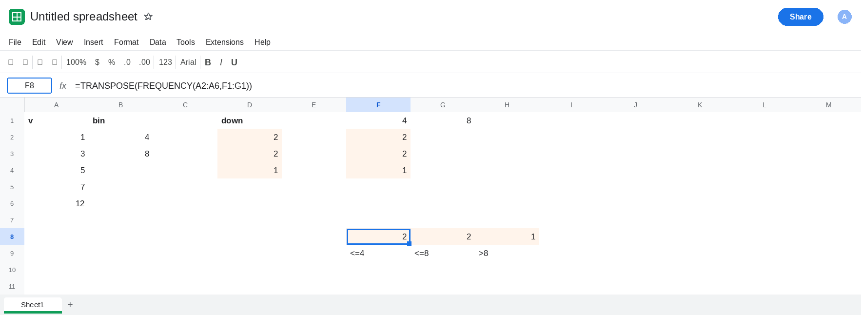
Keep the data in a column. Keep the class limits sorted ascending if you are labeling the first count as the lowest bin. The vertical control D2:D4 is the check: a new layout that does not show 2, 2, 1 for this data is not ready to chart.
Do not wrap F2 in IFERROR. The counts are not an error. The chart range is.
If the counts are stacked under the first bin and the next bin has an empty cell beneath it, FREQUENCY spilled down, which it always does. Transpose it, and add the overflow label. If you only reserved two rows because you had two bins, the third count is the bins page, including the #REF! when that cell was already full.